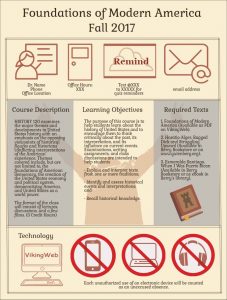
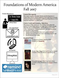
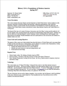
After being inspired by a couple of different things I’ve read and some examples from people who have done similar things, I’ve turned my syllabi this year in less ‘wordy contracts’ and more infograph. Mind you there are still lots of words on the syllabus – but it is less wordy than previously, the font is bigger, and it should stand out from the other syllabi students will be receiving.


I used Piktochart to create it, after a failed first attempt using word. They have lots of snazzy templates, but I couldn’t really find something I ‘loved’. Therefore, I ended up building something from scratch. I based the color scheme and lots of the design elements off of pages from old books (especially books with pictures). I’m pretty satisfied with the final product, although it took much longer to produce than usual. Hopefully, in the future it won’t be so time consuming. Here is a link to the full-size version.