Univariate Plots
We will be working with the same problem and data used to illustrate the explore data procedure:
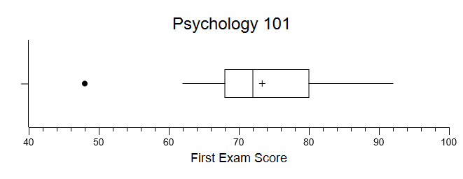
You are an instructor, and you just gave your 15 students their first exam. You obtained the following scores — each score represents the percentage of exam items answered correctly:
| Exam Score: | 74 | 82 | 89 | 62 | 92 | 48 | 72 | 67 | 68 | 79 | 68 | 71 | 79 | 80 | 69 |
Histogram
Pull down the Analyze menu, choose Graphs and Plots, and then choose Create a Histogram. You will be presented with a simple user dialog to select your variable:
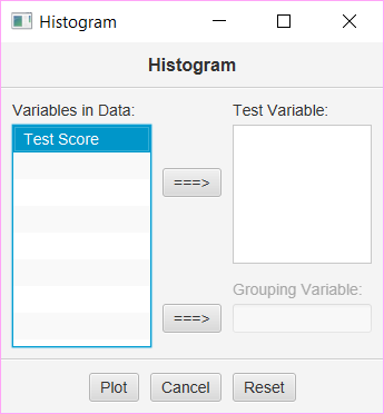
Move your variable to the “Test Variable” box and press “Plot.” Your histogram will display in an interactive window that allows you to modify the image to fit your needs. Make sure to change the title to be more descriptive.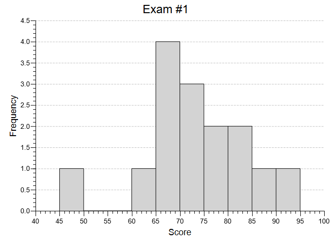
You will see that the default/starting histogram has 10 bins to start with, and these align nicely with your needs as an instructor: 55 to 59, 60 to 64, and so on. Explore the image and plot options — you can increase or decrease the number of bins, rescale the X axis, and change the title and labels. If you didn’t specify a custom title and axis labels for your histogram, you should add those now. When you are finished, you can save your histogram to a file, or copy it to your clipboard and paste it into another document.
Box Plot
Pull down the Analyze menu, choose Graphs and Plots, and then choose Draw Box Plots and CIs. You will be presented with a simple dialog:
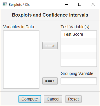
Choose your variable and click Compute. You will be presented with an interactive graphical box plot:
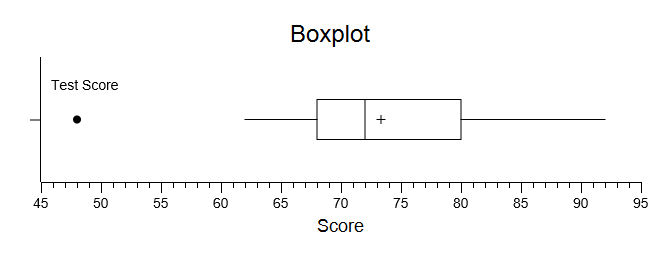
You should always think about how to change the title, labels, and scale to improve on your plot. I changed these things and ended up with:
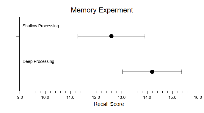
You can also display a 95% or 99% confidence interval. This is especially useful when you have more than one variable. For example, here are the CIs from the results of the two independent samples T test problem:
Stem-And-Leaf Plot
Pull down the Analyze menu, choose Graphs and Plots, and then choose Create a Stem-and-Leaf Plot. You will be presented with a simple dialog to choose your variable. Select your variable and click Compute. Now, you will be presented with an interactive plot:
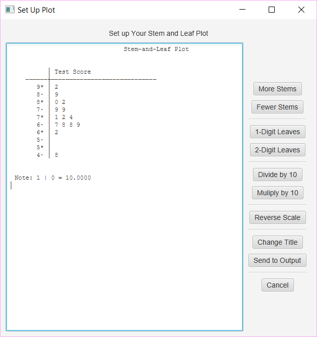
Your options are found in the buttons on the right. Click Change Title and make the title more descritpive, click More Stems once, and then click Send to Output. Here is the output:
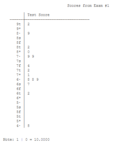 You can experiment with the options until you get a plot that best illustrates your data.
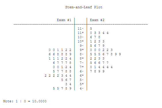
The stem-and-leaf plot can also display data from two variables. These ‘back-to-back’ stem-and leaf plots can be very useful for comparing variables. Here is an example:
Normal Probability Plot
Here is the normal probability plot of the data we used to illustrate the explore data procedure:
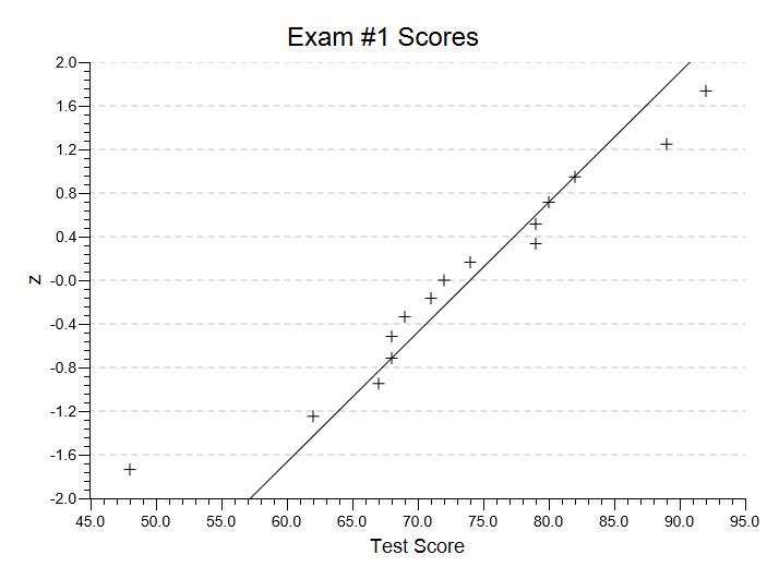
I’ve changed the title an added the Q1-Q3 line to the plot. As you can see, this is quite useful at illustrating the outlier score of 48.
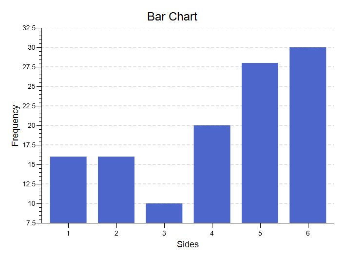
Bar Chart
Here is the bar chart for the frequency data used to illustrate the goodness-of-fit test:
Bivariate Plots
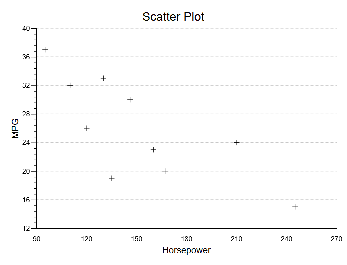
Whenever you are working with bivariate data, you should always get a scatterplot of your data. Here is the scatterplot that is produced in from the data used to illustrate the correlation procedure. This graph can also be created if you pull down the Analyze Menu, choose Charts and Graphs, and then choose Draw a Scatter Plot:
Typically, never settle for the default output. Take time to improve your plot. Here, I have changed the title, changed the scale of both axes, added a regression line, and changed the markers:
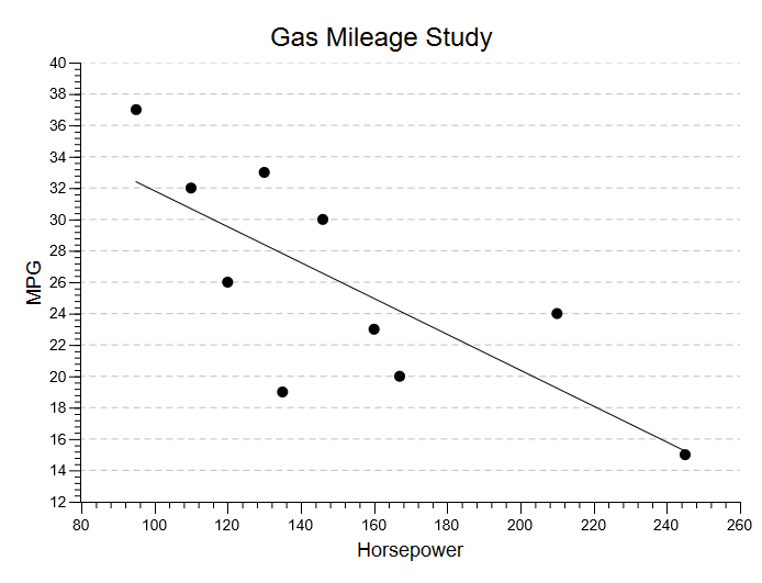
Another option for this chart is to draw a residual plot. This is quite valuable when you are working with a regression problem.

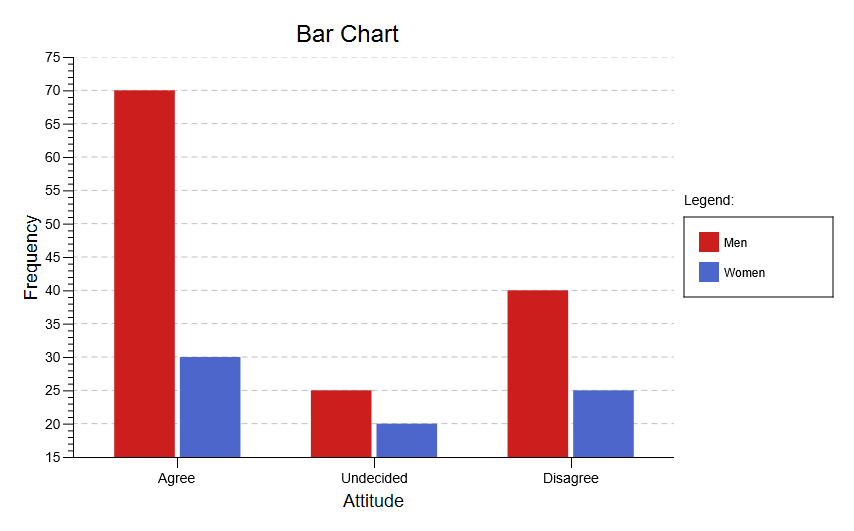
Two-Variable Bar Chart
Here is the bar chart displaying the frequencies used to illustrate the contingency test: